3 ways to avoid glass safety decal shock
Back in the day, you could create and repeat an elegant graphic across large widths of glazing so that people wouldn’t mistake it for an opening… but sadly, this is no longer acceptable.
Published at:

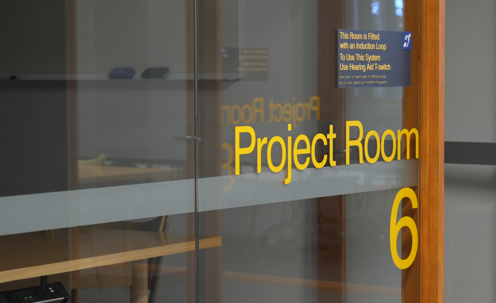
That subtle form of glass manifestation is no longer deemed safe by Australian Standards and disability access consultants. The current requirements for glass safety bands are extensive and quite often difficult to implement — particularly for luminance contrast.
So here’s our tips on how to make the most of the situation.
Design to avoid glass safety decal
Working within the requirements, you may be able to design glazing which doesn’t need the safety marking.
The glass safety marking is required on glass over 600mm wide, so design glass in sections less than 600mm wide, with visible vertical channels between each piece.
Likewise, if the bottom of the glass is 700mm or more above floor, there is no safety strip requirement.
We have seen a number of really nice projects where the glazing uses a feature channel to divide the glass into smaller parts, for example 500×500mm. The channel we like most is a deep angle, with a matte, micaceous black finish, but we’ve also seen standard aluminium channels covered with wood looking really cool.
Make it a feature
So you’re going to have a big solid band through your glass. Why not make it a feature? Here are a few ideas we’ve seen work well:
Fade-out edges.
Visual elements that have meaning to building users.
Beautiful, considered, monochromatic patterns.
If you’re prepared for the impact it will have on the feel of the space, this approach can be great. There are a couple of things to watch, though: the band always needs to contain at least 75mm of solid colour height, edge to edge, and this 75mm must contrast tonally with the floor finishes on either side of the glazing.

Use an experienced signage visual designer
I know, I know, MASS is focussed on the visual design of signage, so of course we would say that! But this is increasingly a specialised item. By working with a good signage designer you can expect:
Better understanding of current requirements, and of dealing with Building Surveyors and DDA Consultants.
Minimisation of the visual impact of the glass safety decal and better integration with other signage, if required.
A very high standard of graphic design/illustration to a feature glazing strip.
Bonus tip!
We’ve seen all of these approaches turn an unwanted horizontal line into something which contributes positively to the visual style, branding and safety of spaces. But remember that their acceptability for any given project is ultimately at the discretion of the Building Surveyor and DDA Consultant, so engaging them in the approach early is bonus tip number 4.